Website redesign
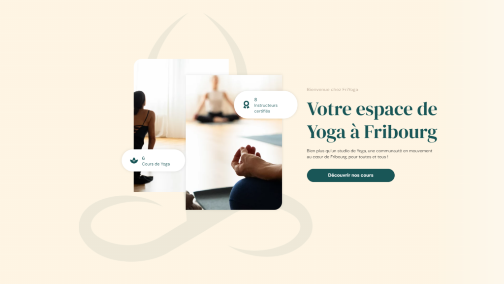
FriYoga asked us to redesign their website following a change of director. For the new manager, Ms Rey, the objective was to reappropriate the visual identity of her company as well as her site.
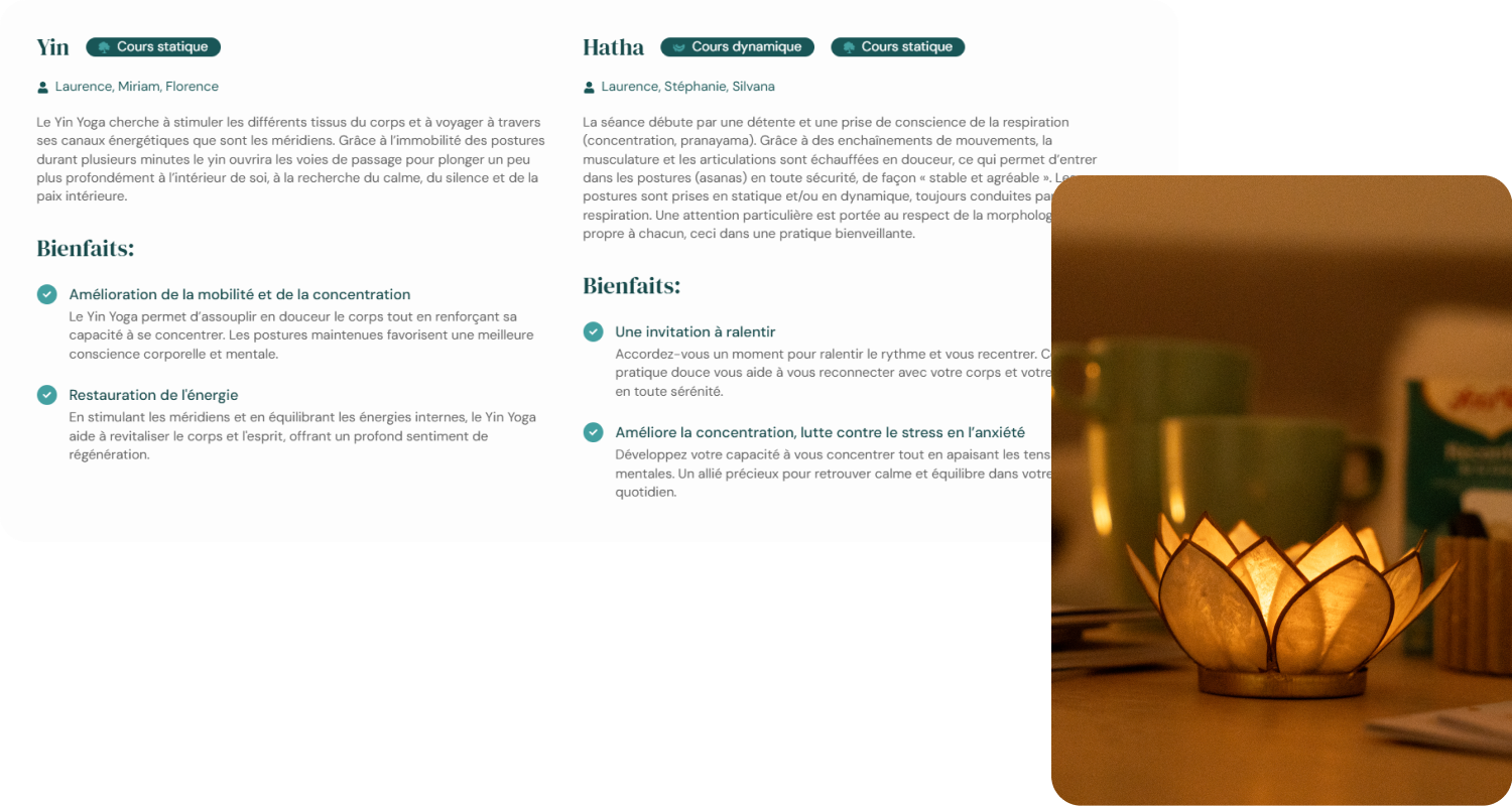
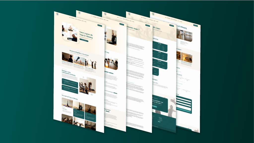
We proposed a streamlined site, highlighting the different courses and the positive points of the sports center.
With a restful aesthetic inspired by the Zen atmosphere of yoga, the website offers clear, user-friendly navigation.
We collaborated with a photographer for the images, to provide a personalized and captivating visual. The photos were designed to be visually consistent with the rest of the site.
The site’s content was designed to be intuitive and structured, with a hierarchy of key information, enabling site visitors to grasp the important elements at a glance.
Logo
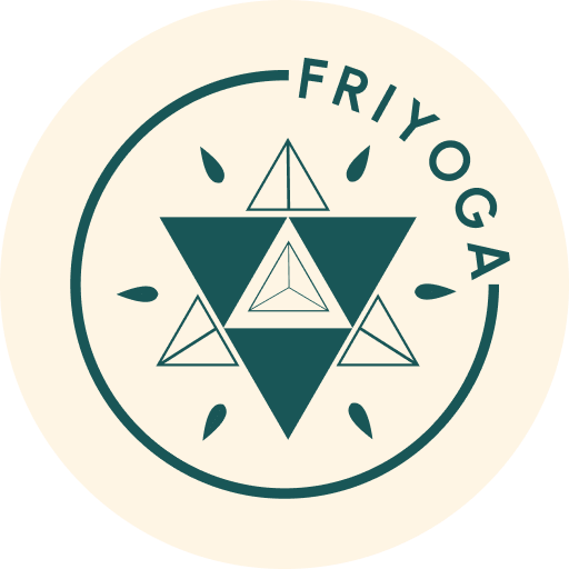
The logo is composed of geometric shapes repeated in a circular fashion, creating a visual reminiscent of a mandala. This composition refers to yoga and well-being. The shapes develop in harmony around a central point, representing calm, serenity and spirituality.
The colors selected reinforce the feeling of calm and softness: a sober, natural green, matched with a subdued creamy white.
The FriYoga name is integrated into the logo with minimalist typography to reinforce the graphic aspect of the rendering.
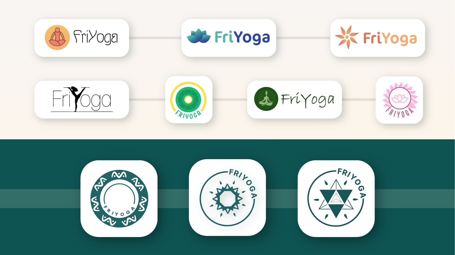
Several proposals were made to refine the choice of logo.
First, we created several distinct logo types, to enable our client to select a style. A few variations were then proposed for the final choice of logo.